Art Direction & Graphic Design
︎︎︎ Information & Contact
︎︎︎ Information & Contact
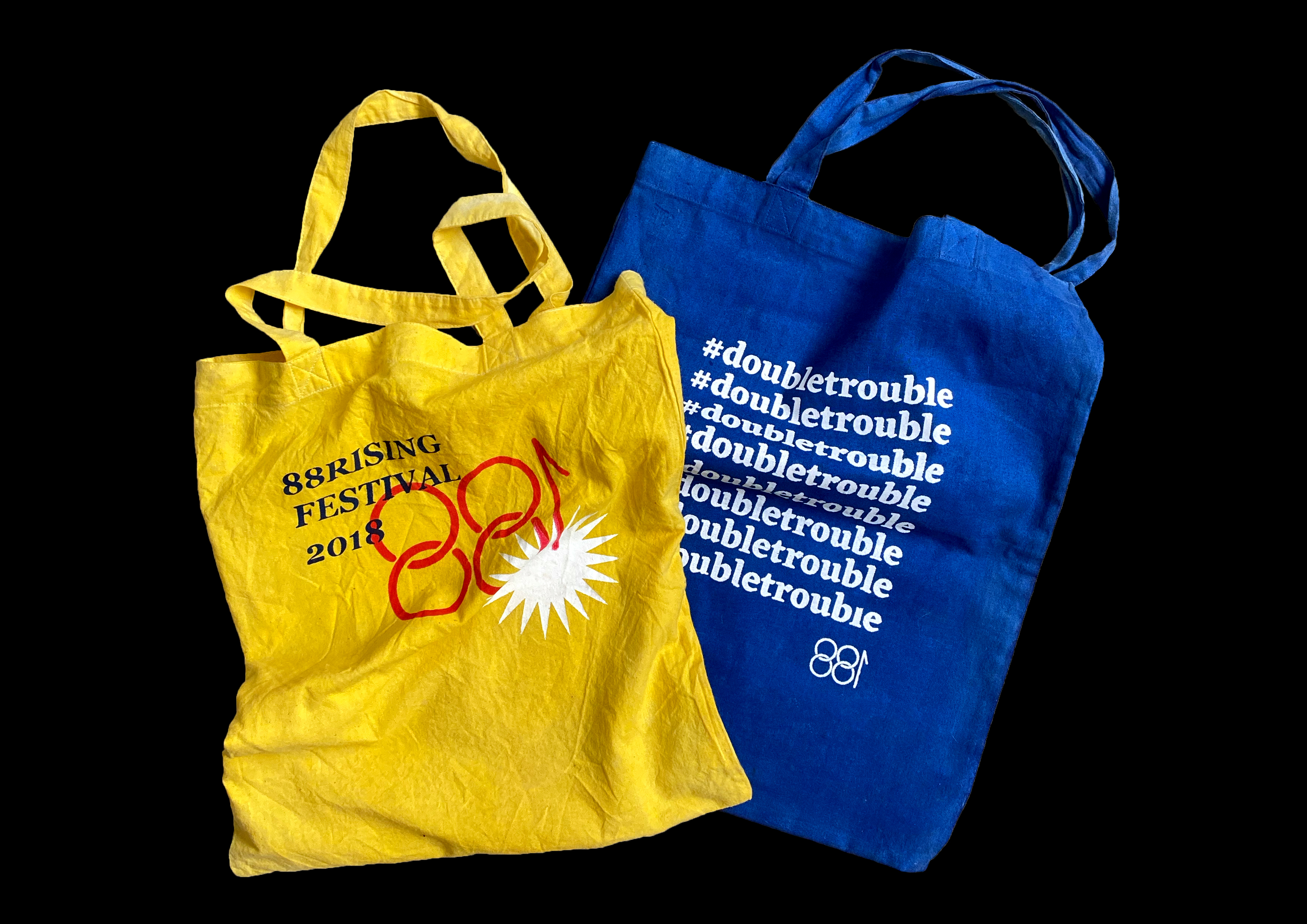
88RISING
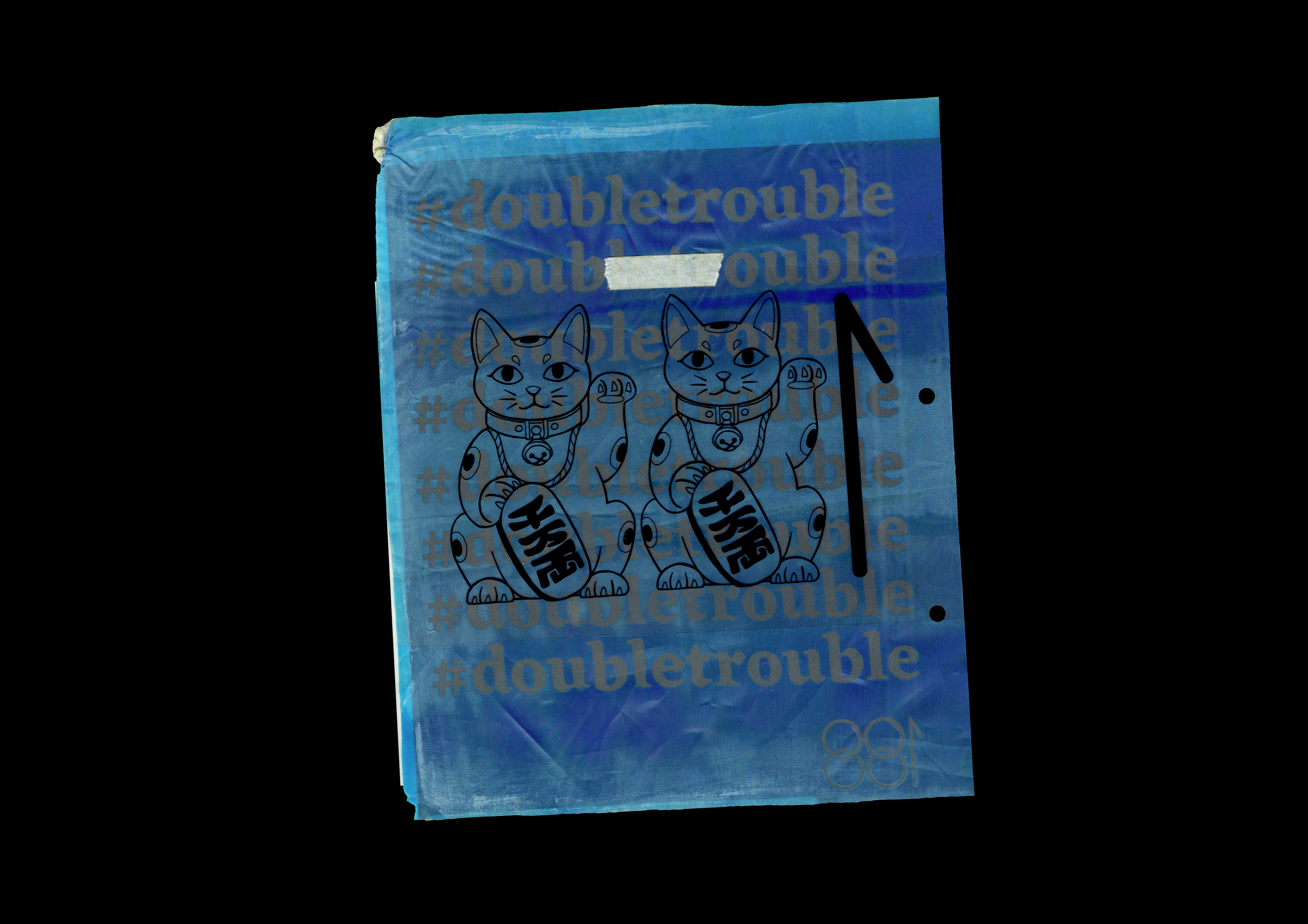
#DOUBLETROUBLE
Self-Initiated
Branding, Print & Motion Graphics
2017
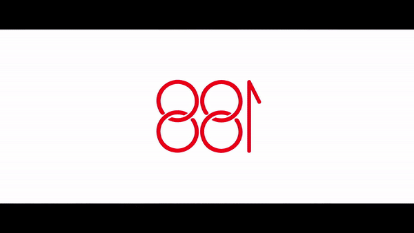
LOGO
︎︎︎
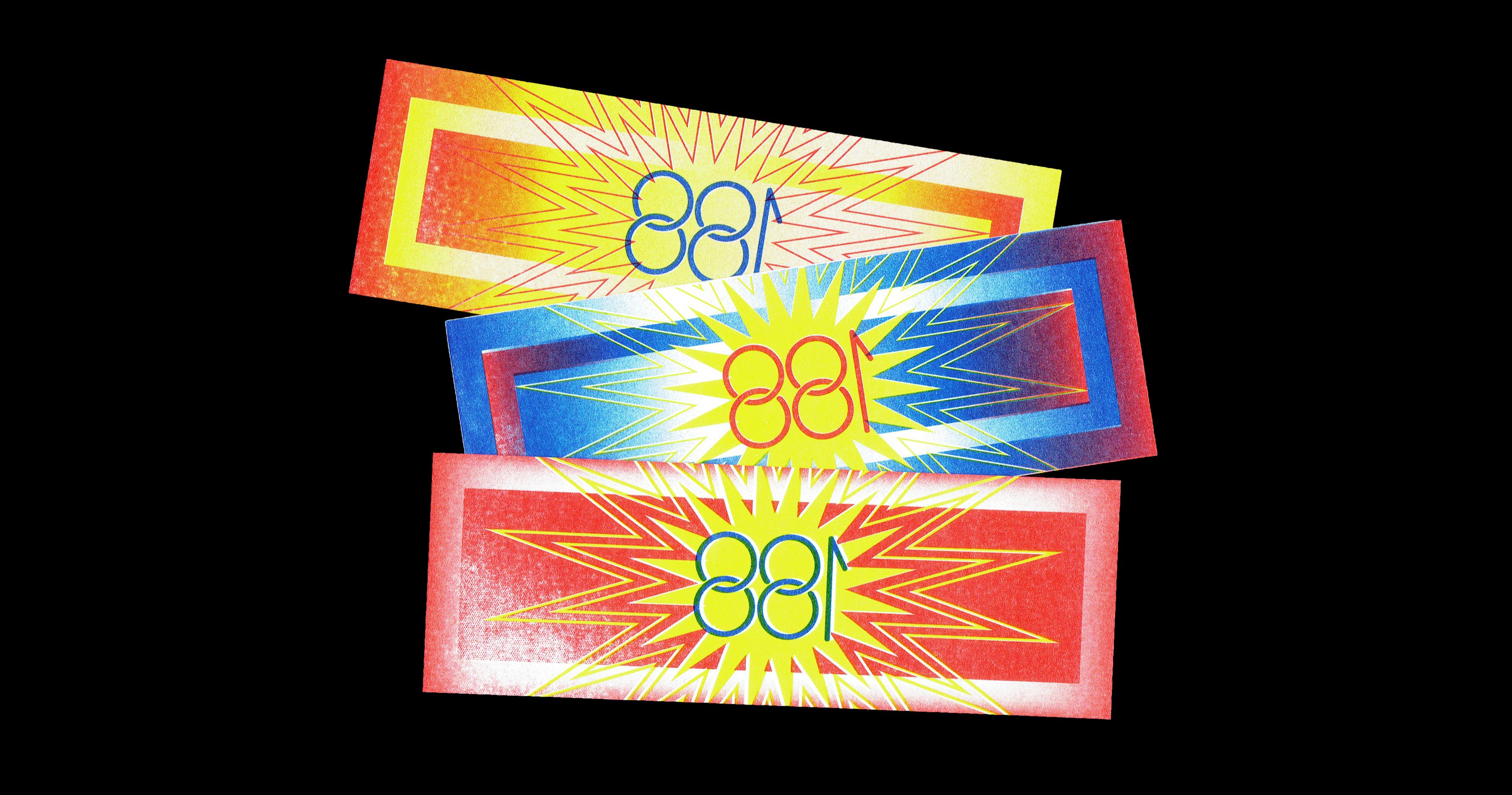
Reworked the existing logo to
Incorporate the brand identity
of “double happiness 双喜” into 88.
Mandarin oranges, lucky cats,
pineapples – auspicious imagery
could be used as a variable logo,
effectively using the brand’s cultural
roots as a visual identity.
Branding, Print & Motion Graphics
2017
LOGO
︎︎︎
Reworked the existing logo to
Incorporate the brand identity
of “double happiness 双喜” into 88.
Mandarin oranges, lucky cats,
pineapples – auspicious imagery
could be used as a variable logo,
effectively using the brand’s cultural
roots as a visual identity.
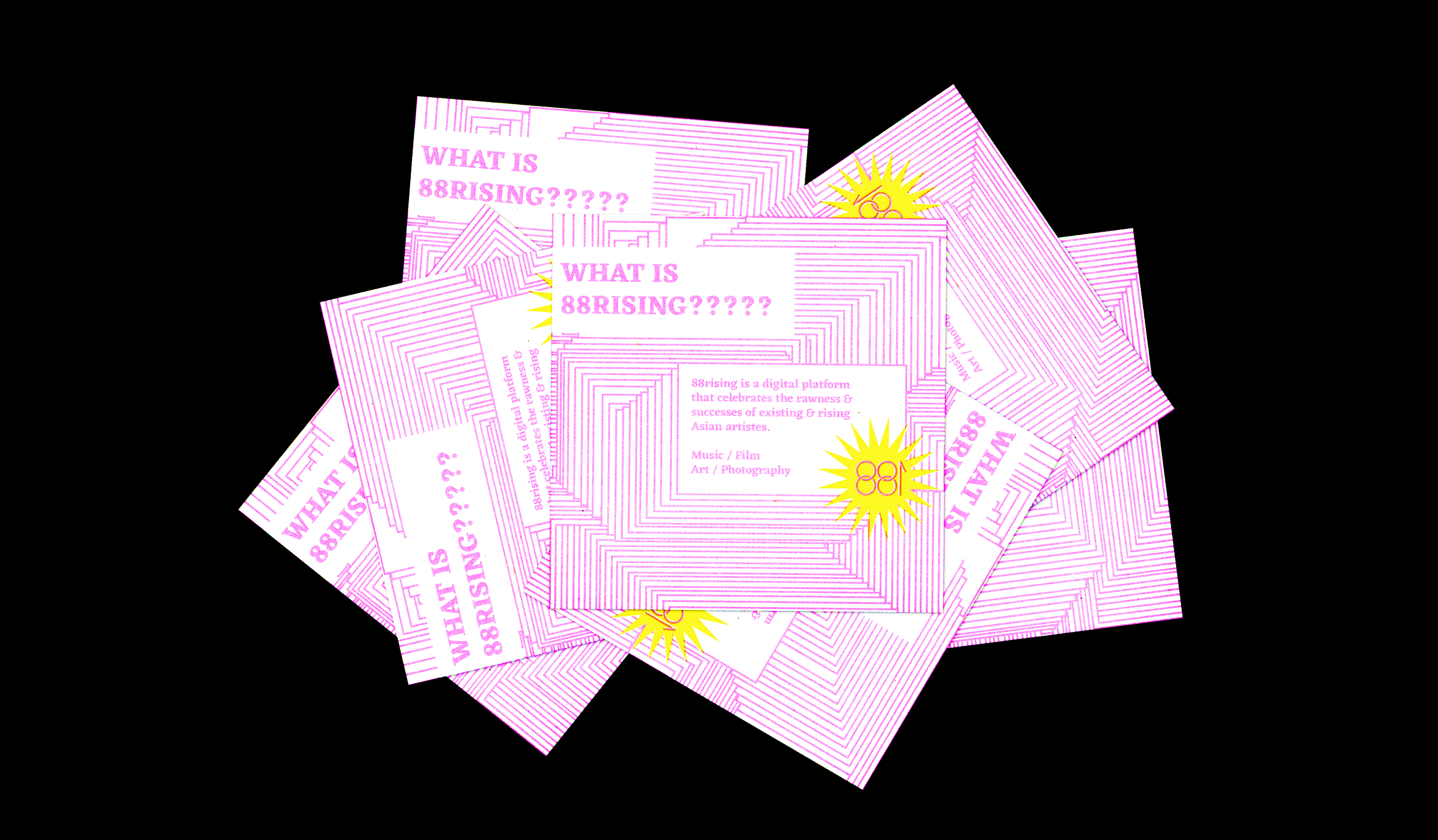
88rising is a mass media company that encompasses a collective of emerging Asian and Asian American rappers and artists. A rather underground music platform (then, 2016), I saw an opportunity to brand 88rising and bring to fruition a festival concept. The visual identity merges kitsch Asian style, post-internet and anti-aesthetics to compliment the unabashed brand personality. Obscenely bold and unapologetic.
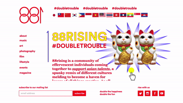
BRAND STORY
︎︎︎
88rising is a community of brazen individuals coming together to support asian talents, a spunky remix of different cultures melding to become a haven for lovers of all things creative. As all good things come in pairs, 88 means double happiness. We brew trouble of the good kind, and invite all who’s interested in experiencing the new wave of asian goodness.
With us, everything is double the happiness, double the fun.
4.5 billion asians in the world, we are 88rising.